Fundamental Media, a leading media buying consultancy service, approached me to create their new visual identity. They were looking to refresh their logo but were keen to retain their core colour.
With this in mind, I explored a range of options that would give their mark a sense of depth, dimension and dynamism, and reflect their vast range of advertising activities within both digital and print environments.
Secondary graphic assets were also created that echoed the characteristics of the logo and helped reinforce Fundamental Media’s visual identity.
M&G Investments are one of the UK’s largest and longest established investment houses. I have worked on numerous projects for them over recent years. These projects have required constant innovative and creative approaches that must still work within the organisations core brand guidelines.
These projects can range from event identities and supporting materials to seasonal ski campaigns that run across Europe. All graphics and illustrations are created by myself and have to be developed to work in a wide range of formats and across all print and digital platforms.
I create this work from initial briefing, which is then taken through to supplying artwork files to M&G’s team of in-house designers ready for reformatting requirements.
The Royal Horticultural Society were looking to create a suite of identities and an awareness campaign for their regional gardens and membership programme. These posters were part of one exploration that was proposed to RHS.
A key element of this was to use close up, intimate imagery which blended with the headlines, reflecting the immersive experience of visiting these gardens during different seasons. The signature name marks are currently used for both printed and digital purposes for each of their four gardens.
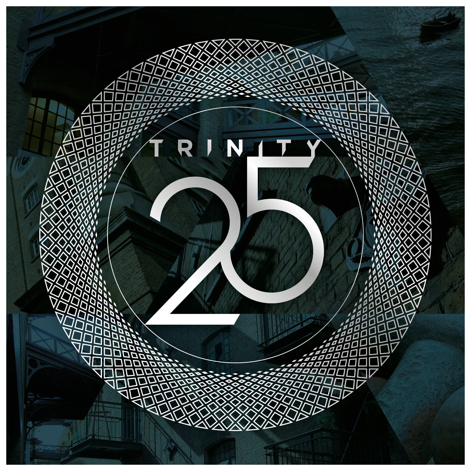
Drinks company, Spirit of Bermondsey, wanted an identity for its launch product, ‘Trinity 25’, a name derived from its alcohol content and its key three ingredients, and sold as a lighter alternative to gin.
The company was keen to promote the heritage of its location, the historic Victorian London docklands but using contemporary styling. With this in mind, I created the Trinity ‘halo’ that was used to encapsulate the name. This was inspired by the ornate ironwork found in the Victorian buildings around Shad Thames. The ‘halo’ overlayed a triangular mosaic. These assets were used across all promotional material.
Knoll is well known for its iconic modern furniture and its classic mid-century pieces. Knoll were looking to promote the merits of these authentic pieces amidst the low quality reproductions that were on the market. I proposed creating a promotional pack that would show detailed images of the furniture and the high quality of their finish. This led to me art directing the photography.
I’ve also designed and illustrated seasonal cards that play on a festive theme that integrate an iconic piece of Knoll furniture. Other projects I’ve designed have included fold-out product launch invites and email newsletters.
M&G Investments sponsor the RHS Chelsea Flower Show and have an exhibition garden each year. The gardens are developed around a key theme which is the starting point for my design concepts and illustrations. These are then used for the M&G visual identity throughout the show. The identity is used on complete takeovers of Sloan Square Underground station and on buses and taxis around London.
Margot London, a beauty and wellbeing boutique in North London, wanted a visual brand that could work for all aspects of their business, from shop signage to sales labels. I created a clean, open and contemporary logo. This incorporated the bird symbol into the ear of the ‘g’, a nod to the owners name.
Ooh Fondue were a pop-up fondue restaurant based in East London. Their identity needed to reflect their light-hearted, retro feel but with a fresh, professional touch.
Avelo provides integrated technology solutions, software and consultancy to the financial services sector in the UK. I developed this identity to represent the converging, integrated aspect of Avelo’s offering. This concept ran through the logo and into the illustrations and colourways that represented the different areas of the business.
Combat Stress is a charity for ex-servicemen and women who suffer with post-traumatic stress disorder and other mental health issues. They were looking to refresh their visual identity and wanted to convey a sense of empowerment and dignity.
The colours represent the three areas within the armed forces – Army, Navy and Air Force. The logo alludes to a medal ribbon bar, representing a sense of achievement and a resilience to their challenges. This sentiment also informed the rest of the visual identity in its bold approach. The identity was also emulated by SSAFA, the armed forces charity.
Dentsu, the advertising and PR group, were looking to produce reports following two aquatic sports events. The first was in Gwangju, South Korea and the second in Hangzhou, China. These contained a large amount of statistics and details, so the challenge was to keep the spreads looking light and digestible. I created graphic elements that could be adapted to these varying levels of content. Both reports were taken from initial brief to supplied artwork.
Sonic Boom Racing are a cycle team based in Colorado. They run an annual race in Louisville and asked me to design a poster to promote the event. I wanted to create a poster that would have impact from a distance but would also reveal a considered detail when standing closer.
The image was also used on t-shirts and online promotional platforms.
Brooke is an animal welfare charity that helps over two million working horses, donkeys and mules around the world. The organisation wanted to update their identity to become more accessible and to clarify their purpose.
Working with their former colour palette, I created a logo that was energised and dynamic, to reflect Brookes active involvement with its end users. This sense of dynamism is carried through into the other graphic assets to extend the brands recognition and visual ownership.
Breast Cancer Care were looking to reposition themselves as a more empowering and enabling organisation, as supposed to being solely a benevolent caregiver. A key way to achieving this was to elevate them out of the ubiquitous pink used within the breast cancer charity sector. The introduction of orange added an energy to the brand that reflected their new core values.
As well as the new logo, I created the typeface and secondary graphic assets that derived from the logo. A complete set of brand guidelines were also created. This was used across all printed materials and digital environments.